Berlitz: Language For Life (0)
Tuesday, October 31, 2006 by , under adkrispies, ads, advertising, berlitz, commercials, spot, tv
Good one. I laughed.
Tuesday, October 31, 2006 by David Claude , under adkrispies, ads, advertising, berlitz, commercials, spot, tv
Good one. I laughed.
Tuesday, October 31, 2006 by David Claude , under adkrispies, ads, advertising, art, artist, creative, illustration, mark ryden, painting

Mark Ryden is more than a genius painter. Mark Ryden is a period in art. You have classicism, neo-classicism, impressionism, cubism, abstraction, surrealism, Mark Ryden, pop art, dadaism, and whatever else. That's how it is, friends. 
Mark Ryden has this carefully crafted and balanced universe inside his mind, which he is currently mapping, painting by painting. He deftly mingles with themes of the beautifully macabre, the childish, the absurd, the grotesque and the fragile, in the same delicate way that a swiss maître horloger would craft the elaborate machinery of a miniature clock.
Each scene, each character he creates, is part of an odd story that one could never tell - yet a story nonetheless. When looking at his paintings, you cannot do anything but admire each of the incoporated elements: whether it's joy, fear, sadness, the stark austère pause of a bleeding child inside a 1800's portrait or a strange animal crying in a little girl's hand in a wistful countryside scene -- for a few minutes there, Mark Ryden owns you.
Here's an excerpt from Mark Ryden's website : "Upon first glance Ryden’s work seems to mirror the Surrealists’ fascination with the subconscious and collective memories. However, Ryden transcends the initial Surrealists’ strategies by consciously choosing subject matter loaded with cultural connotation. His dewy vixens, cuddly plush pets, alchemical symbols, religious emblems, primordial landscapes and slabs of meat challenge his audience not necessarily with their own oddity but with the introduction of their soothing cultural familiarity into unsettling circumstances. Viewers are initially drawn in by the comforting beauty of Ryden’s pop-culture references, then challenged by their circumstances, and finally transported to the artist’s final intent – a world where creatures speak from a place of childlike honesty about the state of mankind and our relationships with ourselves, each other and our past."
Mark Ryden has produced some album covers for the Red Hot Chili Peppers ("One Hot Minute") and Michael Jackson ("Dangerous"), and even has a theme CD, appropriate for the contemplation of his "blood" series, or something like that (Music For Mark Ryden's Blood, on Amazon).
If you want to buy a great book about Ryden, I recommend The Art Of Mark Ryden: Anima Mundi, available on Amazon.
Monday, October 30, 2006 by David Claude , under adkrispies, ads, advertising, dewey, engine, microsoft, search, tech, world wide web
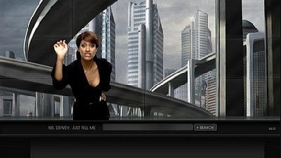
Windows just opened up on creativity...and also on us attention-deficient-unless-hollered-by-a-female-species-artificial-intelligence-thingie-called-Ms.Dewey- male crowd. Introducing Ms. Dewey, an artificial intelligence thingie for Windows Live Search.
Ms. Dewey is actually quite the funny, ironic, obnoxious, modern woman, who will comment your searches on Windows Live and help you through the whole experience. And it actually makes it fun. I left Google today, to play with Ms. Dewey.
Of course, being a guy, you all suspect the first thing I was going to ask Ms. Dewey about. You try it yourself and see. I'll let you enjoy the surprise.
The next thing I asked Ms. Dewey, is about "Apple". So I type in A-P-P-L-E and press "enter". Ms. Dewey replies something like: "Zeros and ones, zeroes and ones, ones and zeroes, all this useless coding, underwear on your head, and you still couldn't create the woman of your dreams". Zing! Interestingly enough, I got the same answer after typing "Microsoft".
I like Ms. Dewey. I think searching while accompanied by someone puts more humanity on the face of the World Wide Web. In spite of what everyone says, I have to recognize it's a great idea.
Yes the interface sucks. Yes, the AI needs work, and yes the loading times are tedious.
But not everyone using the WWW is a nerd, you know. I think normal people can appreciate creative ideas, as a step in the right direction to simple, enjoyable user experience.
There are a lot of steps to be taken before Ms. Dewey is made perfect. For a search engine anyway. I hope they keep at it, and push it further. I'm sure Ms. Dewey still has a lot into her.
Monday, October 30, 2006 by David Claude , under adkrispies, ads, advertising, commercials, golf, spot, touran, tv, vdub, volkswagen, vw
Great direction and art direction on this new V-dub spot for the Touran, some sort of beefed up Golf with hybrid propulsion, made for the UK market. Check it out on Wikipedia. (Thanks, Vlan!)
Monday, October 30, 2006 by David Claude , under ads, advertising, aveugles, blind, commercials, mira, publicis montreal, pubs, quebec, tv
MIRA is a foundation in Quebec, specialised in the breeding, training and care of guide dogs for the blind. Here's a smart ad for them, from Publicis Montreal. Questionable film direction, but hey. Smart nonetheless.
Monday, October 30, 2006 by David Claude , under adkrispies, ads, advertising, ale, beer, bishops, site, world wide web
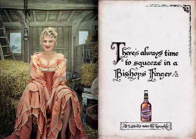
Now this is quite the beer campaign. Or is it? Like me, you've probably never heard of Bishop's Finger, UK's oldest brewski (since 1698). A bit of info from the Bishop's Finger website: "The Bishops Finger Charter decrees that it is brewed only on Fridays and then only by the Head Brewer using an antique Russian teak mash tun. He takes mineral water from the brewery's own 200 ft deep artesian well and adds Kentish malt from Denne Hill Farm and East Kent Goldings hops". Wow.
Another interesting bit of info, is that Bishop's Finger ale is also referred to as the "Nun's Delight". Case in hand, the creatives didn't have to search too far for this most expected, yet "had-to-be-done" campaign.
Finger applause. (Thanks, 10ad!)


Monday, October 30, 2006 by David Claude , under adkrispies, commercials, explorer 7, microsoft, spot, tv, world wide web, youtube
Another finger-related ad, this time for Internet Explorer 7. "Everyday tasks made easier", is the proposition on this one. I can hear the yells of outraged Firefox users from here. As someone pointed out on the YouTube comments section: " Exactly what Explorer is. Fat n' cheesy".
The music sounds familiar...I've been trying to figure out where I heard that tune before...maybe a Sesame Street sequence ? Help me out here.
Monday, October 30, 2006 by David Claude , under adkrispies, ads, advertising, aids, cliff freeman, poster, print
Interesting spoofing of the world-reknowned "sex positions" posters by Cliff Freeman & Partners, New York, letting us know that all this creative nookie yoga may lead to AIDS, and of course - death. The poster is currently distributed to the college crowd. Client: Youthaids. (Thanks, AdCritic!)
Monday, October 23, 2006 by David Claude , under adkrispies, ads, advertising, marketing, men with cramps, viral marketing, world wide web
Did you know that menstruation exists also in the male species ? Yes, friends. It does. I swear.
If it didn't, why would they even call it "MENstruation"? Hello. If only women had it, it would be called "womanstruation", this cries for logic. Lots of men actually experience it, and suffer secludedly, crying in shame in the silence of their homes.
It's called "Cyclical Non-Uterine Dysmenorrhea" or CNUD. The gassy feeling, the tummy hurting, the pouty feeling, the weewee shrinking, the abandonment of regular activites such as drinking beer on poker night, washing your car, or playing with your tools. You think you have it? Don't know where to look for answers?
There is help.
Dr. Gerhardt Fardel, leading researcher in CNUD, has put together the fantastic site Men With Cramps, storefront website of the MacInnes-Porritt institute.
Among others on the site, you will find the most hilarious videos ever made for this absolutely ridiculous illness. I don't know who is behind Men With Cramps, or why it's even there, but I heard they even ran ads in the local Washington paper for men with "CNUD" looking to participate in a study. The point is: These guys had the whole web fooled.
This is not a joke. It's a real class in the school of "How Do To Real Working Viral" 101.
And not without reason: The whole writing is subtly off. If you lacked attention, or read a paragraph in "Z", you would think this is for real. The TV documentaries are just brilliantly odd and hilarious. Watch them all. For your comfort, I've added a few of them on the AdKrispies site, but you have to see the main "Men With Cramps" website, for the rest of the best. It's worth your time.
I don't know if this is a teaser for something else, but I'm impatiently waiting.
(Thanks, Annick from Moskito!)
Monday, October 23, 2006 by David Claude , under adkrispies, ads, advertising, agency, magazine, platinum, poster, print, sundown
The copy reads: "Life revolves around the sun. Use Sundown."
Wait, wait, wait. Don't you think that imperative in advertising is something that's obsolete? "Use" our products. "Do" this. "Eat" that. This belongs to another generation. Motivative advertising has long been dead and buried. This generation would probably like to read "Sundown. Life revolves around the sun", or better yet the simpler "Life revolves around the sun".
But hey. Judging from position of said title addition, and slightly smaller size, I'm sure of this:
THE CLIENT MADE THEM ADD IT. Shit happens.
This being said, great photography from PLATINUM, FMD - these guys are amazing.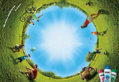

Monday, October 23, 2006 by David Claude , under adkrispies, ads, advertising, billboard, gel, pubs, taft
As the product is targeted towards teenagers, must we believe that there's a second level of understanding? I'm probably the only one to get there, anyway. Agency unknown. (Thanks, BriefBlog!)
Thursday, October 19, 2006 by David Claude , under adkrispies, ads, advertising, agency, billboard, guerilla, playstation, poster, PS3, sony
If you guys don't know it yet, the most loved and awaited PS3 will hit the stores across North America on November 17. A teaser campaign has recently begun, titled "Play B3yond", which is currently hitting the NYC (corner LaFayettte and Bond).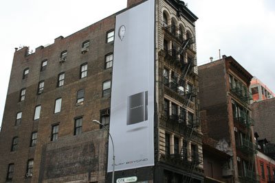
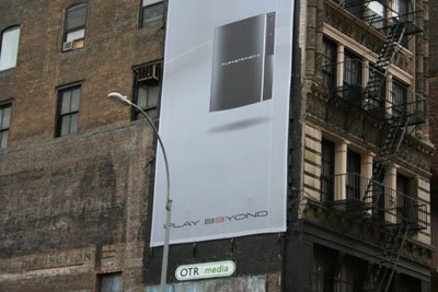
Also, you can already feast your eyes on the recently released commercial for this upcoming launch, now available on AdKrispies. Featured soundtrack is An Ending (Ascent) by Brian Eno. The commercial is once again the work of crazy awesome agency McKinney + Silver. I bow in your general direction. Need kickass partners in Canada? Write me. Hehe. Shameless plug.
Ps3 coming. Better get those sleeping bags ready in front of your local electronics store now.
Thursday, October 19, 2006 by David Claude , under adkrispies, ads, advertising, bored, fun, games, play, sonic, video games
Try this convenient, browser-sized Sonic The Hedgehog. Live from AdKrispies for your procrastinating pleasure. (Note: I know, last game sucked. This is much better).
Thursday, October 19, 2006 by David Claude , under adkrispies, ads, advertising, agency, biscuit, mother, pig, reginald pike

Hello.
My name is Red.
I'm a pig.
Recently I had a supporting role in a television commercial for a major international cellular telephone provider.The commercial was directed by the Perlorian Brothers and written by Mother NY.
Everyone was very nice to me, and I think I did a pretty decent job for my first time on set, but I've since learned that I'm scheduled to be slaughtered in a week.This is not good for an actor's career. I knew it was a non-union job and the residuals weren't anything to get excited about,but I wasn't expecting to be hung by my foot and have my throat slit.
Fortunately, my new friends at Reginald Pike, Toronto, Biscuit, L.A., and Mother are working to find me a new home at a petting zoo (despite all this, I love humans).
You can help me too by getting a limited edition t-shirt with my picture on it at
http://www.reginaldpike.com
They're only $20 and proceeds go to my care and feeding.
Please Help.
NOTE: While it's quite unclear where to get the T-Shirts on the Reginald Pike web site, get more info from Glossy's Blog here.
(Thanks Annick!)
Thursday, October 19, 2006 by David Claude , under adkrispies, ads, advertising, agency, challenge, creative, defi, games, online, stella artois
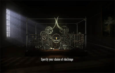
Stella Artois is history. History in its making, and also history in the making. Pretty much the same can be said about their commercials, which never fail to communicate emotion and then instantly pinch you with a subtle bit of humor.
And now, this. This, my friends, is the best advertising/web experience that could ever be produced for Stella Artois. It sticks to brand personality like a baby to a teat, or a man and his beer. It is called "Le Défi" (french for ze challenge). And it's from Canada! Yay.
What it is: Stella Artois once again draws the consumer within a strange universe, this time on the worldwide web.
You - and a friend whom you might challenge - will have to unravel the secrets behind a mechanical contraption, some sort of gauntlet. There are many challenges to take part in, all of which require quick thinking - as time of the essence. To the victor, a chalice of Stella Artois, paid by the loser. Of course its all a tacit bet, but still an interesting one. The whole ensemble is well narrated by a mysterious voice, and the overall "steam era" look and feel is quite a success.
The whole campaign was devised by Stella's Canadian agency Lowe Roche Toronto, whom haven't feared to put top dollar for their accompanying ambient outdoor media (thanks to Glossy for the pictures):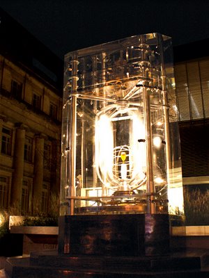
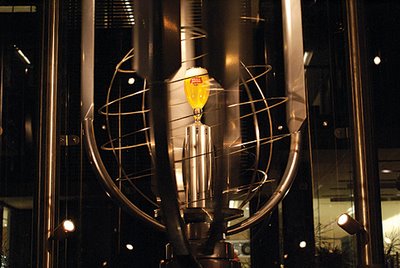
This is the kind of experience that should be lesson 101 in contemporary branding for announcers. Create a plausible universe for a brand, and bring the consumer to experience it. Nothing new, of course. I just don't see it applied everywhere so effectively.
This is just stunning, and certainly generates a lot of word of mouth. (Thanks, Glossy!)
To try the Défi for yourself, click here.
Thursday, October 19, 2006 by David Claude , under adkrispies, ads, advertising, android, bartle bogle hegarty, BBH, commercials, johnnie walker, pubs, spot, tv
Ah, scotch and ads, two of the world's greatest time wasters. Now, look at this fantastic spot from BBH London, of course quite inspired by Philip K. Dick's novel "Do Androids Dream Of Electric Sheep?" and the not-so-recent Spielberg "A.I.". Great references, and great use of these references. I feel that the proposition is new, the direction (Dante Ariola) quite eminent and message, to the point. Indeed, keep walking.
Thursday, October 19, 2006 by David Claude , under adkrispies, ads, advertising, bravia, fallon, sony, spot, television, tonic, tv
You've all been expecting it furiously, and most probably, you've all already seen it. Nevertheless, I would put shame to this blog if I didn't feature Sony's latest Bravia commercial: Paint. A few months ago, I had an entry about the making of of this fantastic piece of work, but now it's finally out in full splendor.
And I'm a little bit disappointed.
While the previous "balls" ad was awe-inspiring with its delicate and supple soundtrack, its tranquil strength visuals, this one is kind of a let down. Now don't get me wrong, I think it still is an incredible visual achievement. Yet I cannot do anything but agree with my colleague Barry Lachapelle from Enter The Chapel : the one major flaw of the ad is the soundtrack. That music has been overused for everything. From TV-Station candid camera breaks to industrial machine ballets, you. have. heard. it. everywhere. I believe it's Strauss.
With the previous track on the "Balls" spot, the world discovered the music of Swedish-Argentinian José Gonzalez. But everyone knows Strauss. Genius, of course, but way waaaay overheard. Come on, Fallon and Tonic!! You should've taken your time, and found another inspired and chilling soundtrack. You can't work so long, so hard, and not make this absolutely perfect. Change it. Do a special edition with better music. It's still time.
This being said, congrats. Great production value, great color, indeed it's a good spot (*coughballswasbettercough*).
Monday, October 16, 2006 by David Claude , under adkrispies, ads, advertising, commercials, print, saatchi, wonderbra
"Hypnotizing". Awesome, awesome idea from Saatchi and Saatchi.
Monday, October 16, 2006 by David Claude , under adkrispies, ads, advertising, durex, mccann erickson, print
Fantastic lubricant campaign from McCann-Erickson, Italy. (Thanks, I Believe In Adv!)
Monday, October 16, 2006 by David Claude , under adkrispies, ads, advertising, jupiter drawing room, post-it, print
This is laugh in loud hilarious. From The Jupiter Drawing Room. (Thanks, Twenty Four!) (Thanks, Anonymous, for posting the credits).
Monday, October 16, 2006 by David Claude , under adkrispies, ads, advertising, MIT, sketching, tech
This is the coolest sketching system you'll ever see. I'm sure this piece of software will find its way to distributors and buyers pretty quick. It's simply something the world had needed since a long time.
Monday, October 16, 2006 by David Claude , under adkrispies, ads, advertising, drag-and-draw, philips, simplicity, tech
Every year, Dutch electronics giant Philips holds an event titled "Philips Simplicity", where they present their latest high-tech practical concepts and experiments. This year the event was held at the ExCel Center in London's docklands, and apparently put emphasis on "healthy living" and the embetterment of daily household activities.
> ...such as drawing on walls. Philips recently has had this knack with light-emitting sources. Well, behold the "Drag-And-Draw", a light-emitting 'pen' that can draw on any surface, including walls. Thanks to a simple interface, one can also animate the pics that have been drawn, and they can be 'erased' with the click of a button. Instant personal favourite.
>...Hate your old alarm clock? Well how about this soft-wakeup alarm light: it simply starts to brigthen up one hour before you wake up, so you can awake gently and naturally without putting stress on your body. According to GadgetCentre, it will be on sale in France this year, and in UK by 2007. How about Canada? Boohoo.
>...and how about this state-of-the-art hospital examining room? The good people at Philips believe that these examining rooms are often cold and well...unhospitable. The use of colourful lighting and ambient light-patterns could help improve the general mood of patients (as well as doctors), and make the experience less scary. Of course this opens up a gigantic can of worms about practice and vision, but who cares. This is the realm of ideas.
Check out the other fantastic Philips gadgets and concepts on PRessLink.
Monday, October 16, 2006 by David Claude , under adkrispies, ads, advertising, agency, print, simple green
Just so you know, the Simple Green company makes 100% non-toxic, bio-degradable household products. This is the best campaign I've seen (up to now) for the general household product category, as well as the environment-friendly category. If the announcer had enough 'nads to publish these, bravo. I think the the art direction and copy ("Clean conscience") are arch-brilliant ; add that to great tongue-in-cheek humor and you've got yourself a great campaign, that really gives this product a unique, funny and moreover, remarkable personality.
These would probably get me to buy some Simple Green right away. I don't have the agency's name, but many kudos to creatives Shaun Bruce and John Rekoumis for the great idea. (Thanks, Ihaveanidea!)


Monday, October 16, 2006 by David Claude , under adkrispies, ads, advertising, playstation, poster, print, psp, pubs, sil
A most altruistic idea, for PSP users often found too engrossed in a game to talk. From agency Sil Malaysia. (Thanks, Ziritione!)
Friday, October 13, 2006 by David Claude , under adkrispies, ads, advertising, bogusky, burger king, crispin porter, eat like snake
Another proof that Crispin Porter + Bogusky understands advertising. And advertising understands them. This provides equilibrium to all things most important to man in this unverse. Sex, video games, cars and burgers are now handled by very apt minds.
Friday, October 13, 2006 by David Claude , under adkrispies, ads, advertising, BMW, bruce lee, spot, tv
Simple, intelligent. Your kung-fu is stronger than mine. The end copy says (loosely translated): "Don't adapt to the car road. Be the car road." (Thanks for the correction, TVSpot).
Friday, October 13, 2006 by David Claude , under adkrispies, ads, advertising, agency, cmon, corsa, opel, pubs, spot, tv
I truly would have loved to see the creative's initial presentation of this commercial to the client. I'm sure I would've learned a lot of things I still don't know about advertising.
Friday, October 13, 2006 by David Claude , under adkrispies, ads, advertising, aides, aids, commercials, social, spot, tv
Edgy commercial for AIDeS, a french organization for the fight against AIDS. There are so many unorthodox and unethic propositions in this commercial, this could be sued from here to Jupiter. "But they do get the point across in a humourous way!", says the lawyer. Agency unknown (and I'm sure they like it that way). (Thanks, AdArena!)
Friday, October 13, 2006 by David Claude , under adkrispies, ads, advertising, air max, nike, rise of the hybrids, viral marketing, wom, word of mouth
Maybe I'm a little late on this one. But then again I've figured out most of you would want to have a nice, safe place to watch the new Nike viral, Rise Of The Hybrids.
"From the chaotic aftermath of a galactic impact an orders emerges unlike any other. An explosion of new forms never seen before. Suddenly, all combinations are possible; animals fuse with other animals. Plants fuse with minerals. Beings and objects fuse with earlier ancestors of themselves. This is the rise of the hybrids", reads the very Ed Wood-ian introductory text to NikeLab's Rise page.
Rise of the Hybrids is actually the merging of four of Nike's Air Max technologies (Air Max 90, 95, 97, and women's Footscape) to form the new Air Max 360. And I think I know the reason for this sudden "emerging" in hybridness (can I say that? Well I just did).
Now, I don't know about you all, but I'm well behind in Nikeology. I'm beginning to feel that all Nike's Air or Max or Moto or Skate or Blah shoe lines only resonate within the company, and not exactly within the consumers. Given, they have cool commercials. They have cool shoes. But when the common street athlete hits the store looking for a new pair of digs, Nike fails to be recognized as the perfect "sports" shoe: there are just too many types to choose from, they are just too flashy, and some other brand name shoe is probably better for such and such reason.
You don't know what to buy, and moreover, a store clerk will probably counsel you to buy Saucony or Adidas for your "specific" needs. Ouch, Nike, ouch. You lost your specificity. A basic marketing law: When you broaden a category too much, you lose your ability to be the "specialist" in that category. Thank you Al Ries.
Now I hope that this "hybrid" merge idea is something that's bound to bring a solution to that. I Nike's Rise is actually the rise of less variety, more specificity. If that's the case, I say it's the rise of a good idea.
Wednesday, October 11, 2006 by David Claude , under adkrispies, ads, advertising, bratislava, hdi, istropolina, peugeot, print
Peugot HDi. Too bad there's the long copy from hell (I'm sure the AD had to clench teeth on this one), but still an incredibly good flash from Istropolitana D’Arcy, in Bratislava . (Thanks, Adarena!)
Wednesday, October 11, 2006 by David Claude , under adkrispies, ads, batey, print, strip, waxing
This'll put a smile on any poker face. Fun stuff.
The signature reads: "Strip - Ministry of Waxing". From agency Batey, Singapore.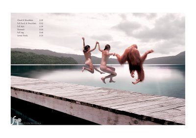
Wednesday, October 11, 2006 by David Claude , under a6, adkrispies, ads, advertising, audi, bartle bogle hegarty, BBH, commercials, tv
Here's a great piece of commercial filmmaking for the Audi A6. Very remindful of Stanley Kubrick's visual style, or Tron's Steven Lisberger - all in favor of very still cam shots. But it's actually the great work of director Johnny Green and Knucklehead, from London, from an original thought by agency BBH London. Enjoy.
Wednesday, October 11, 2006 by David Claude , under adkrispies, ads, advertising, guerilla, madd. impact, print, wom, word of mouth
Krazy good ambient media for Mothers Against Drunk Driving from agency Calder/Bateman, Edmonton. MADD has this history of excellent advertising, and these moms truly sound like awesome and daring clients. The stuff dreams (and less DUI charges) are made of. (Thanks, Ihaveanidea!)

Wednesday, October 11, 2006 by David Claude , under adkrispies, advertising, hyper island, inspiration tuesdays, patrick berg, portfolio, student
 It's always interesting to see what students/juniors are made of these days. And it's also very motivating for senior art directors to see new minds, new ways to approach the design problematic, and fresh styles. Every now and then, by pure chance, we'll see this one, good portfolio that just reeks of talent. Well, I Stumbled on Patrick's page, exactly by pure chance.
Folks, this is one good design portfolio. Well Pat, here's your 15 minutes of fame.
Patrik Berg is a 24 year-old student born in Stockholm, who's now studying design at Hyper Island in Karlskrona, Sweden. Wow. When you're studying design in a place called "Hyper Island", you can't suck. You just can't. Our man Patrik produces awesome work in different design media, exploring print, packaging, cross-application of technology and software, illustration and more.
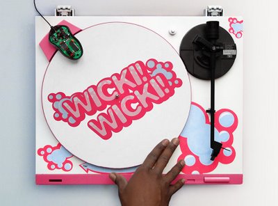
Indeed, his craft is very imaginative and, if I may add, narrative - a quality I think is essential in any creation of intellectual property. Patrik looks like he has a keen understanding of the bond between form and function, a notion that shows in everything he produces, especially in this group work in which he and his teammates produced a flash game controlled by scratching a turntable, as part of a student project. I didn't do stuff like that when I was in school. I did Bauhaus. Bah.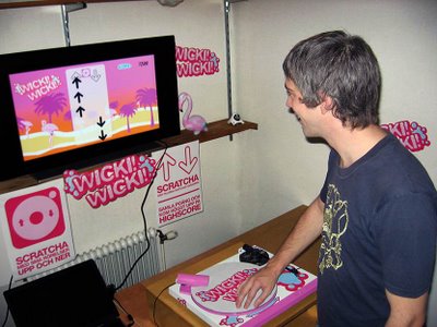
I cannot say enough good about this portfolio. In the words of an ultimately cool swedish film director, Joakim Eliasson, (which whom I once worked and got this saying I still use nowadays, in a thick Swedish accent) : "To me, it is perfect". If I was a big and intelligent ad agency somewhere in California, or if I was Crispin + Porter (I wish), I'd do me some good and hire this guy now.
Patrik Berg is available for an internship from Autum 06 'til March 07, as he states on his webpage. I've no idea if he's been hired or interned as of writing this, but if you're interested, I suggest you hurry.
You understand that it's now mandatory that you check out Patrik's page (patrikberg.com) now.
You can also check out Crew11, the global (albeit very dark) portfolio of all the students at Hyper Island. Man, that name is cool.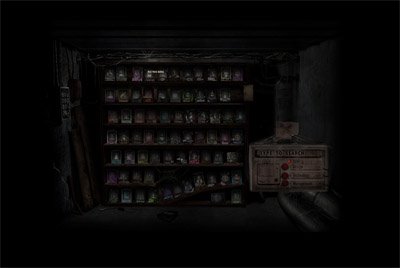
Friday, October 06, 2006 by David Claude , under adkrispies, ads, agency, ideas, marketing, promo, self-promotion
Send us your stuff ! AdKrispies will be delighted to present your agency's ads with full credit, because it is thanks to people like you that we're able to keep going. Whether you're from Guatemala, America, Canada, CentralAmerica, SouthAmerica, España, or a country that doesn't finish in "a", WE WANT TO SEE YOUR STUFF. YOUR ADS. YOUR IDEAS. Envíenos sus anuncios. Schicken Sie uns Ihre Werbungen. Emita-nos seus comerciais. Envoyez-nous vos pubs ! (Thank GOD for Altavista).
Just click on this link to reach my direct email. Get on AdKrispies! If it's good enough for your clients, it's good enough for the real world.
(Hahah, I don't know if I should've said that).
Thank you.
Friday, October 06, 2006 by David Claude , under adkrispies, frederator, ipod, psp, rss, short films, short movies, toons, videos

I cannot say enough good about Channel Frederator. I've just discovered them recently as I was (patiently) browsing the net on my PSP.
Channel Frederator is actually a Cartoon Blog that's updated every tuesday. It's made by the people, for the people: People like you and me (but also professional studios) send in animation shorts, and 4 or 5 of them are featured on every episode. The short movies feature different techniques, from high-tech digital stuff to very simple doodles. The episodes watch themselves in a breeze.
Frederator has acquired an incredible amount of popularity on the web, they have a huge and very faithful fanbase, and that's all simply because it's fun to watch cartoons.
You can download them directly to your PSP, with the RSS feature. If you have a PSP, all you need to do is to head to www.channelfrederator.com, and click on "Subscribe via RSS". (as you may see, you can also click here, but I wanted you to visit their site). Doing so will add an RSS link to your bank, from which you'll have access to all 50 episodes.
Of course, you can do it on your PC as well, but it's not as much fun as to watch your cartoons in bed with your PSP :)
Here's a sample cartoon from Frederator Episode #8, something that'll stay in your head forever. Song from Australian band TISM. Enjoy.
Friday, October 06, 2006 by David Claude , under adkrispies, ads, advertising, aral, helmets, print
Very effective (poster ads?) for Aral Helmets, making the roads unbelievably safer for all of us biking types. (Thanks, Twenty Four!)


Friday, October 06, 2006 by David Claude , under adkrispies, ads, advertising, energizer, magazine, poster

Maybe you can't see the picture well, so let me explain: The kid is able to be flying on an little RC plane, because the energizer batteries are so powerful. Simple, and effective.
Agency unknown, sorry.
Friday, October 06, 2006 by David Claude , under adkrispies, advertising, contrapunto, mercedes, print, smart
You should, because I had one.
Ready? Okay. Here are car ads. For the Mercedes Smart. That actually show a *price*, AND a *simple, decent concept* ! AT THE SAME TIME! And...oh God. What? THREE TV ads to accompany that? You mean that the Smart Car Dealers Association got together and agreed on a full-fledged conceptual, intelligent campaign? My God. "I must be 'shrooming". Bravo. Encore.
No wonder they're called Smart. And that also applies to their agency, Contrapunto, Madrid! ¡Bravo amigos! ¡Si solamente los vendedores de coche canadienses podían hacer lo mismo!* suspiro * (Thanks, AdArena!)


Friday, October 06, 2006 by David Claude , under adkrispies, ads, advertising, ing, site, viral marketing, web, word of mouth, world wide web

I usually like the TV commercials that ING's agency produces (while I couldn't get a hold of their name) - I think they're always very pertinent, believable, and well executed. Actually, I think most of ING's communication is a lot more pertinent and inviting than most banks (in Canada anyways), and I still don't understand why banks haven't thought of a way to competition such a consumer-worthy system.
Much has to be said in the same way, about their viral site, MoveOutMoveUp. The site's main proposition is to present "buying your first home" as something that's possible, and accessible.
Wow. Something that actually. Concerns. The consumer. No time wasted on trying to con the consumer with "Ooo, ahh, we have a human approach to banking" people pictorials this time.
Just one. Simple. Reality. "Paying rent isn't just getting old, it's getting expensive". Hello. Now THAT speaks to me, mr. early-thirties-guy-with-not-enough-savings-or-balls-for-a-decent-down-payment yet. But as always, ING uses its authentic, bullshitless communication strategy to convince me that there's a solution for that. And this solution is displayed inside an entertaining and clear experience. Now that is effective advertising, plain and simple.
I'll stop gabbing now, but promise you'll check out the ING site. It's worth the trip (Thanks, Ihaveanidea!)
Wednesday, October 04, 2006 by David Claude , under adkrispies, ads, commercials, peugeot, spot, tv
Ladybugs having a grrrrreat time in a Peugeot. Ahh, this is ze love, ma petite chérie *kiss**kiss*.
Wait...if they're called "ladybugs", this means that...*frown*...noo.
Wednesday, October 04, 2006 by David Claude , under adkrispies, ads, advertising, bolinki, commercials, tv
Hahaha. I don't know - I just felt like posting this. This, friends. This is a textbook example of how low a creative's career can sink. This is where commercials go to die. You're on top of your game these days? Look at this.
Look at this...and think.
(EDIT: Awww. They removed it. Too bad...it was so...good.)
Wednesday, October 04, 2006 by David Claude , under adkrispies, ads, advertising, agency, commercials, ford, tacoma, tv
Oi laddie, that sure is one tough Jeep.
Wednesday, October 04, 2006 by David Claude , under adkrispies, ads, advertising, commercials, toyota, tv
You might also remember this earlier spot from Toyota. I wonder how they still managed to make the above idea. I can picture a young junior at (insert Toyota's ad agency here) going: "HEY I GOT A GREAT IDEA WITH THE LOCH NESS MONSTER!" ..."-Forget it Joey, it's been done before. By us." ..."NO-NO, but this...THIS IS DIFFERENT!" ..."-Uh-uh. Why don't you sit down, Joey, and calm down a bit". "WHAT'S THIS PATRONIZING ME ABOUT? I HATE YOU ALL!" .
And somehow, a senior creative found a lonely TV script by the copy machine, and went "Hee hee", and the spot was made.
Somewhere. Somewhere, is the name of a lonely bridge, with a lonely junior on it.
(Boy, I can't believe I (or you) made it this far into this absurd script. On with the show.)
So uhh... TOYOTA!
Wednesday, October 04, 2006 by David Claude , under adkrispies, neil blomkamp, nospot, short films, short movies, tempbot
Here's a fantastic short movie by Neil Blomkamp, titled "Tempbot". Tempbot is an experimental robot hired by this company to perform late-night tasks, and generally act as a normal employee. A normal overworked, underpaid employee. The movie was awarded Best Overall Film at Creativity's NoSpot Film Festival 2006. No wonder - this is the best thing that happened to movies since Blade Runner. And before that, Woody Allen. Watch it now.
Tuesday, October 03, 2006 by David Claude , under adkrispies, advertising, agency, bloghop, self-promotion, vote
If you scroll down the page a bit, you'll see (on the sidebar) a little tab that says "Rate me on BlogHop.com!", accompanied by little color squares.
If you like AdKrispies, help us get known by more and more people by voting positively (the little green square). If you don't like us, or like us less, or used to like us but not anymore, well you're entitled to your freedom of speech - so click the other little squares.
Your daily visits encourage us (I say "us" because it's trendy to speak of your stuff in the plural form, but I'm actually all alone here) to write more, and come up with better articles! Thanks for your viewership, and talk to your friends about AdKrispies!
Tuesday, October 03, 2006 by David Claude , under adkrispies, ads, advertising, coca-cola, coke, commercials, inspiration tuesdays, tv
I decided to feature this in Inspiration Tuesdays because I thought this general Coke campaign is quite inspiring indeed, and is a well-thought refreshment of the Coke brand.
By now, you have probably seen the nifty Coke Side Of Life animation, where a guy puts a quarter inside a vending machine, and you discover this little big happy Coke-makin world.
This is only one of the many Coke-commissioned ads, created by great animation and design minds of this world. Actually, here's another one of these ads, as featured on YouTube:
What you might not have known, is that there's a colourful website (hosted in Germany) that comes with the campaign, and features interesting interactive bits. I think the website is sparkling with creativity, and is a great example of opening a whole new world for the consumer, and for the brand as well. It looks like anything is possible in there. I like when a brand does more than providing entertainment as means of connecting with the consumer, but adds to it by creating intellectual property in which the consumer will be drawn, will learn to like, and will participate.
Discover the whole thing yourself: Enter the Coke Side Of Life by clicking right here.
On a pleasant side note, it's interesting to know that while the "Coke" side of life is an interesting and aspirational slogan, some people thought of it otherwise.
Tuesday, October 03, 2006 by David Claude , under adkrispies, advertising, inspiration tuesdays, the dreamer, web, world wide web

The Dreamer is a website revue of the coolest things the web has to offer these days in terms of branded content, music/entertainment, photography, corporate stuff and more. It's divided into categories for your comfortable use, and you can discover a lot of interesting stuff in there.
Just like I did for the following article, right above this one. Yay! Easy references.
Tuesday, October 03, 2006 by David Claude , under adkrispies, design, eric lerner, inspiration tuesdays, mr city men

The characters from "Mr. CityMen" are the work of Eric Lerner, a young 3D animator and designer from Jerusalem. The Mr. City Men are Mr DejaVu , Mr Afraid, Mr Fortune, Mr Dreamer and Mr Sunken - all of whom live excentric or surrealistic adventures inside the urban jungle. Featuring outlandish soundtrack by different indie artists, Eric's CityMen animations could be described as the "short lucid dreams of a overly joyous industrial designer", and portray the vivid paradox between the harsh scenery of urban no-man's lands and the careless, colourful Mr. CityMen.
There are 5 movies total, plus awesome wallpapers you can download. View them all, it's incredible work and something that gives you a small virtual vacation at the same time. Great work, Eric. (Thanks, TheCoolHunter!)
Tuesday, October 03, 2006 by David Claude , under adkrispies, ads, advertising, design, illustration, inspiration tuesdays, shinybinary
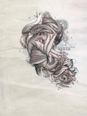
The first sentence in the "info" part of the Shinybinary website is "Nik Ainley is a UK based web designer who also has a passion for producing personal art and illustrations. After teaching himself Photoshop in his spare time while gaining a degree in physics at Imperial College London...". Now wait a second here. This guy actually taught himself Photoshop "in his spare time" while educating in rocket science, and is now producing incredible illustration work using software (which he probably taught himself as well) like 3D Studio max, Cinema 4D, Bryce, Poser and Xara 3D ? Became listed as the "Top 10 up-and-coming creative talents of 2006" by Computer Arts magazine? Made the top covers of many popular books, websites and magazines ?  Now I call that genius. Talented genius. And there's no denial that, from the care and detail shown in his work, our man truly has passion for what he does.
Nik creates carefully crafted environments, well-defined by any superlative in the dictionnary of modernism. Some creations feature mechanized portraits in knot-like metallic arrays, others feature strange abstract nebulas that loom inside a dark atmosphere, or gigantic cumuli-type clouds in colourful spaces. Waltzing from the abstract to the representative, Nik Ainley seems to have a sculptor's imagination, trapped inside the mind of a crazy impressionist painter.
The results are impressive indeed. Wait no more and check out Shinybinary.
Monday, October 02, 2006 by David Claude , under adkrispies, ads, advertising, agency, bartle bogle hegarty, BBH, leo burnett, mark tutssel, second life
You might have heard through many different channels that Chicago ad agency Leo Burnett was going to launch Leo Ideas Hub, a virtual counterpart to their agency network, inside the online world of Second Life.
According to AdAge, "...Chief Creative Officer Mark Tutssel said the shop's presence within the virtual world would break down geographical barriers to collaboration between his network's 2,400 creatives. "I don't want brands shackled by geography," Mr. Tutssel said. "It lets all of our creatives live in the same place."
Great idea, Mark. But that's not all.
Among other news in the september 29th edition of the MediaGuardian (dot co dot uk) :
BBH launches virtual advertising agency. And I quote: "Bartle Bogle Hegarty has opened a virtual advertising agency. BBH's move, within online virtual reality world Second Life, comes as rival Leo Burnett unveiled plans to set up Leo Ideas Hub, a virtual creative department, using Second Life to bring together its agency creatives from around the world."
BBH's virtual agency. Cosy. Of course, the general public isn't allowed.
What's also interesting is the Guardian's following quote: "Advertisers and agencies are eager to tap into the fast-growing social networking phenomenon but many have been holding back unsure about the best approach."
Eager? Now, I'm a bit surprised : Until last year and the arrival of the YouTube phenomenon, ad agencies were quite slow in adopting the general internet as a true, mass-media channel, let alone the "social networking phenomenon". Even now, the web thing is still misunderstood by most : web-based communicational actions are sometimes still a sideshow to an official ad campaign, and only when budget permits, says mommy. (Except for the recent Rush Mylo web-based campaign, but as I previously said, the guys at McKinney + Silver just rule. Don't tell me if there are TV executions, I don't wanna know.)
I'm being a tad sarcastic, but you can't blame them: There was internet, yes. There was the web, yes. But these were only enveloppes, only life support. There were no true media channels within the web that concentrated users on the same viewing point, for prolongated and recurring periods. "Surfing the net" was, and still is, an act that constantly challenges an ad agency's capacity to own the consumer.
But now you have consumer-generated content, you have branded content, you have video games, you have online communities : you have ways to reach the public on its own turf.
And now that AdAgencies are recognizing these new channels, they're re-discovering the possibility of "owning" the consumer. They're accepting these new channels as "mass-media", best proof being that they're even organizing themselves inside them. So I'm saying, great! NOW GO, AND EDUCATE THE CLIENTS. Not that all of them are miseducated: Telus, God bless them, already had the idea.
Leo Burnett, Bartle/Bogle/Hegarty, these are only the first. I'm sure Montreal agencies won't take long to follow-in, most of them are media-attention whores. Wow, did I say that?
To TEH FUTURE.

Copyright 2008 Ad Krispies